
Nine industries, nine takes on a landing page.
Self-directed concept builds, not client engagements — unaffiliated rebuilds exploring a different industry and visual register each time. Each one starts from the same question: what does this specific business actually need its homepage to prove in the first few seconds, and what's the smallest, most honest set of design choices that proves it? A detailing shop and a boutique hotel don't share an answer, so the nine builds don't share a template — the constant across all of them is testing range, not repeating a formula.
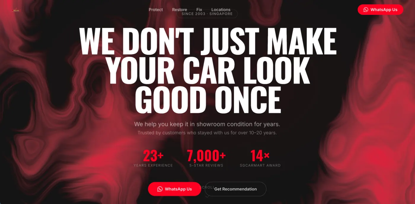
Auto Detailing & Paint Protection
SingaporeA test of restraint for a trade that usually sells on before/after gloss shots: black-and-white type carries the hero instead, with a slow-looping fluid-ink texture doing the atmosphere work behind it. The brief was whether a detailing brand could read as premium without a single car photo above the fold.
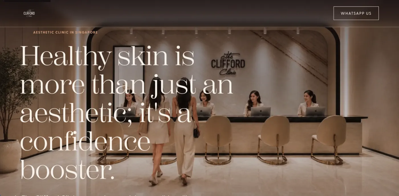
Aesthetic Clinic
SingaporeAesthetics clinics tend to default to clinical white and stock photography of models mid-treatment. This build goes editorial instead — a warm palette and oversized serif type borrowed more from a magazine spread than a medical brochure, testing whether trust can be built through tone rather than sterility.
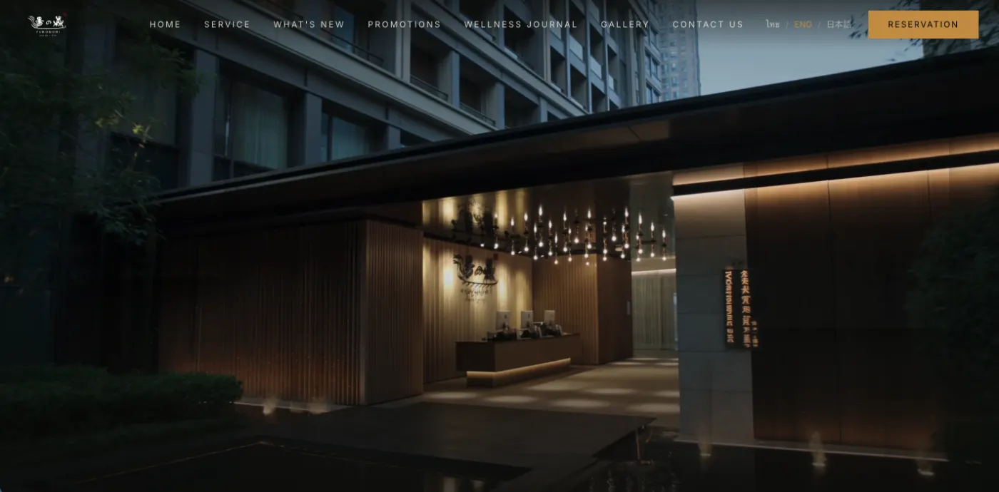
Onsen & Spa
SingaporeA dark, lantern-lit register built for a business that serves a genuinely mixed clientele — the navigation switches between English, Mandarin and Japanese without breaking the layout. The concept tests whether a wellness brand can hold a moody, low-light aesthetic without losing legibility or feeling closed off.
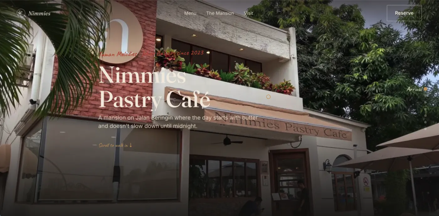
Pastry Café
Johor BahruBuilt around a single conceit: the hero scroll simulates walking up the drive and through the door of a converted heritage mansion, before settling into the menu and interior shots. It's the most narrative of the nine builds — testing how far a scroll-driven sequence can carry a story before it starts working against the page's actual job of getting someone to visit.
Boutique Hotel
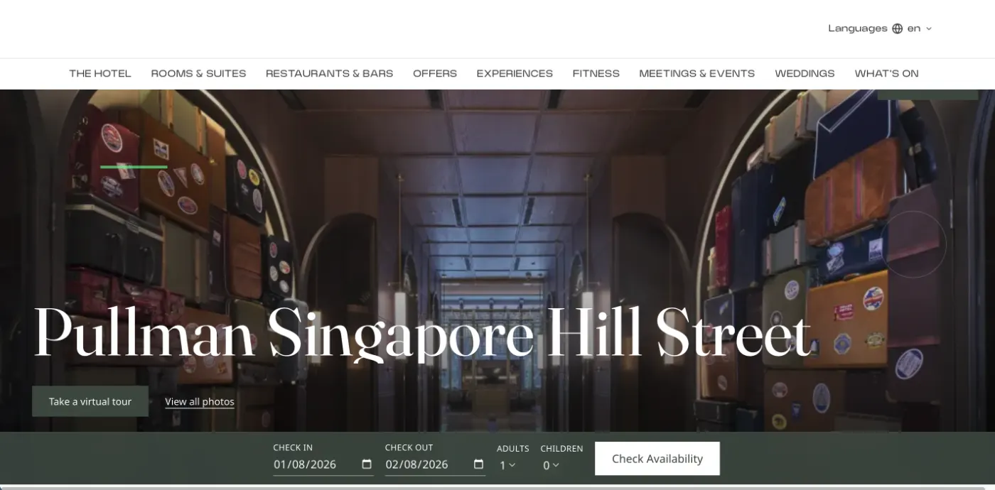
SingaporeHospitality is the one vertical here where the hero has to do actual transactional work, not just set a mood — so this build puts a full date-and-room availability search directly in the fold instead of behind a separate booking flow. English and Mandarin variants ship from the same layout, testing how much a booking widget can carry before it crowds out the photography.
Cleaning Services
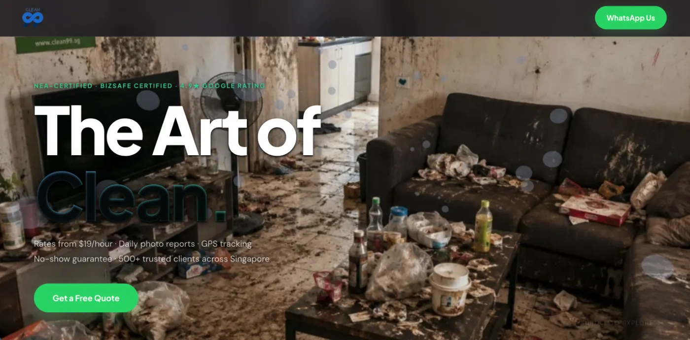
SingaporeA scroll-scrubbed before/after video hero, where scroll position drives the video's currentTime rather than autoplaying it — the same technique this site's own homepage background uses, tested first here on a cleaning-services brief where the before/after transformation is the entire pitch. Paired with the static build below to compare conversion-relevant load cost against visual impact.
Cleaning Services
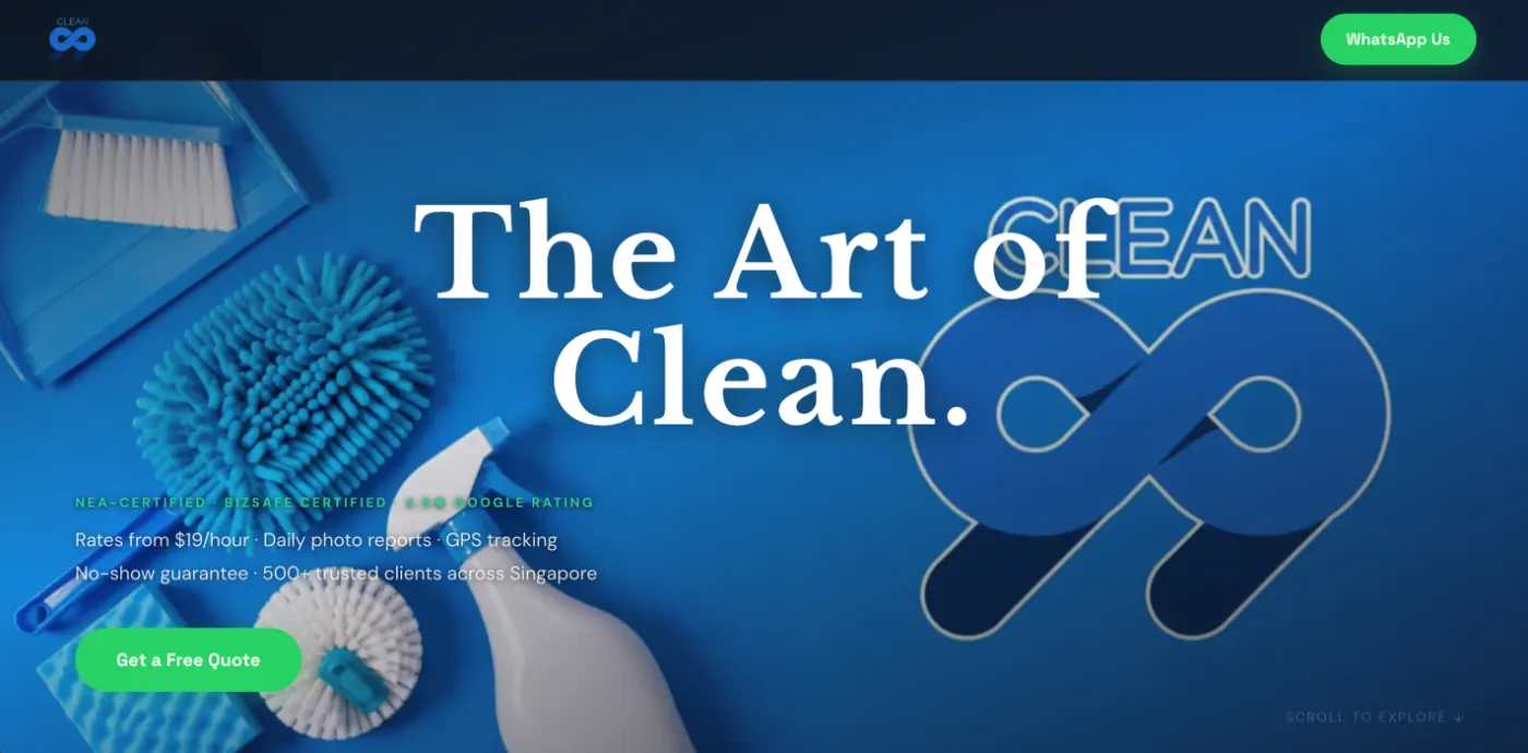
SingaporeThe same cleaning-services brief rebuilt without the scroll-scrubbed video — static imagery and CSS-only motion instead, as a direct lighter-weight comparison. The pairing exists to make an honest case: is the video hero's visual impact worth its bandwidth and complexity cost, or does a well-composed static build get most of the way there for a fraction of the load.
Fitness Club
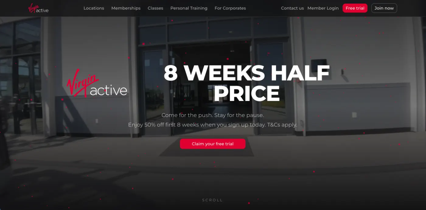
SingaporeA gym chain's actual funnel problem — which of several locations does a visitor mean — solved directly in the layout: a location switcher up top feeds a membership comparison table and a free-trial capture form, rather than routing every visitor through a single generic signup page. High-energy imagery is kept in check by a strict grid so the conversion path stays the clear priority.
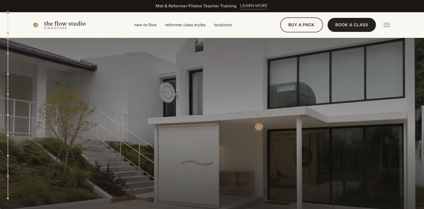
Reformer Pilates Studio
SingaporeThe most stripped-down of the nine — a minimal editorial layout that leans on negative space and type rather than motion, built to test whether a boutique fitness brand reads as premium through restraint alone. A region-switching studio locator handles the multi-location logic without breaking the calm, uncluttered feel the rest of the page is built around.